Mission · Who We Are · Data Ethics
Visible Data Branding
dataviz for all points with humans at the heart. With a consistent, accessible brand.
Brand Assets & Media Kit
Welcome to the Visible Data brand hub. This page contains our official brand guidelines, asset files, and company descriptions for media, partner, and event use.

Company Boilerplates
Short Description
Visible Data is a purpose-driven software company building Pier, a workflow-integrated dataviz coach and governance engine. We empower transforming raw data into accessible, brand-safe data stories, ensuring corporate compliance with both EU and US accessibility legislation. Our mission is dataviz for all points with humans at the heart.
Logo & Marks
Please do not alter, stretch, or recolor our logos. Ensure adequate clearspace around the mark.
Visible Data
Our company logo is designed to envoke looking upwards and into the future using all five of the primary colours from our brand palette. Black and white alternatives are provided.
Visible Data’s colourful geometric square logo featuring a coral-orange circle and a smaller golden-yellow circle with dark maroon outlines, resembling a planet and moon or an eye pointing to the top-right corner of the image. They are centered along a diagonal band of lime green that cuts through the middle of the design, separating expanding blocks of turquoise in the top-left and crimson in the bottom-right.
Alt-text for logo
Visible Data’s colourful geometric logo with a coral-orange circle + a smaller gold circle, resembling a planet & moon or an eye pointing to the top-right centered along a diagonal band of lime green, separating expanding blocks of turquoise + crimson. Alt-text for logo below 255 characters.
![]()
![]()
![]()
Note that our logos were designed and built using {ggplot2} and the R language.
Pier, Compass and Foundry
Pier is our software platform that incorporates both Compass and Foundry.
Pier’s circular logo featuring a stylized white 3-dimensional pier that loops to form the capital letter ‘P’. The structure stands on thin vertical pillars against a background of three horizontal color bands: a pale blue top band representing the sky, a turquoise middle band representing the sea, and a coral-orange bottom band representing the land.
Alt-text for Pier logo
Pier’s logo, stylized white 3D pier that loops to form the capital letter ‘P’. The structure stands on thin vertical pillars against 3 horizontal colour bands: a pale blue top band (sky), a turquoise middle band (sea), and a coral-orange bottom (land). Alt text for Pier logo below 255
Compass’s circular logo centering a teal figure designed to resemble a standard accessibility icon with open, outstretched arms. The figure is enclosed by a thin maroon ring accented by four curved arrowheads acting as compass points. Three of the arrowheads are dark slate gray, while the top-right arrowhead is highlighted in green, pointing upward to symbolize inclusivity, direction, and forward progress.
Alt-text for Compass logo
Foundry’s circular logo featuring a stylized maroon crucible or pouring ladle tilted to the right, with a straight vertical handle extending upward. Nestled inside the vessel is an orange circle, while a vibrant pink circle and a teal circle float outside to the right, mimicking a pouring or casting motion. The shapes are enclosed by a maroon border on an off-white background.
Alt-text for Foundry logo
![]()
![]()
![]()
Accessible Color System
Our brand palette was developed from our GPCDS idents and contains five categories of colour, each containing a secondary colour and three different shades. These cards represent how the colours work together and their semantic meaning.
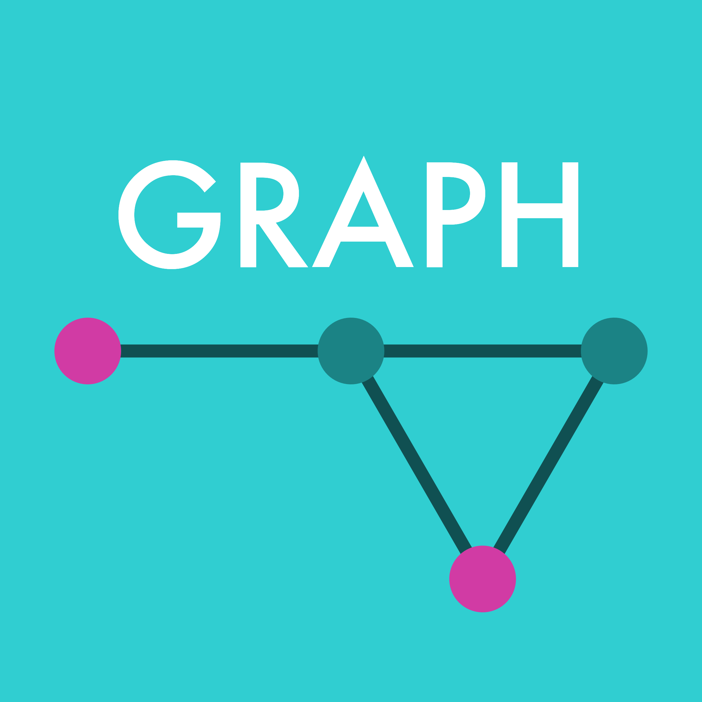
#30CED1 Graph
- Medium turquoise colour
- Represents positive sentiments
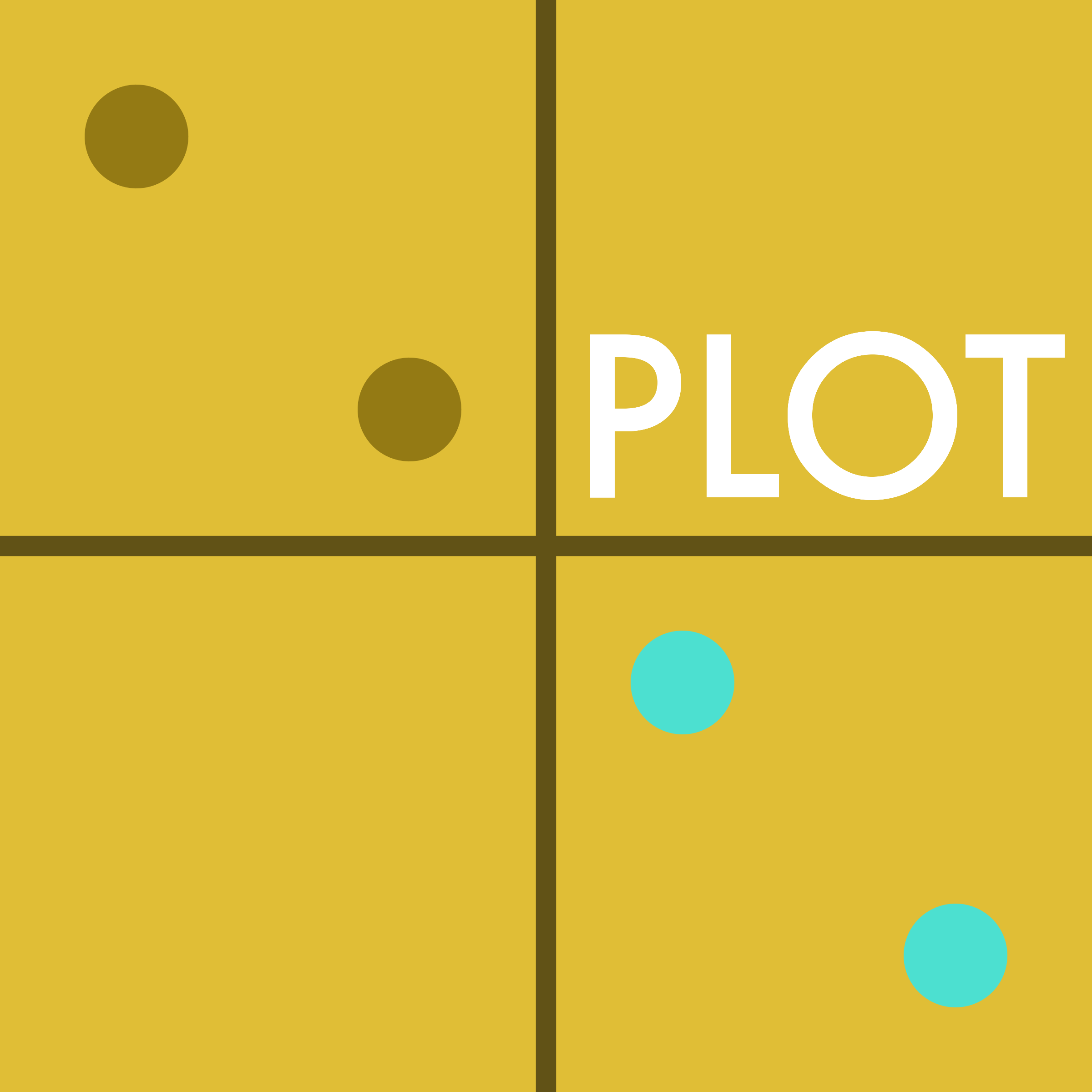
#E0BE36 Plot
- Macaroni and cheese colour
- Represents different topics
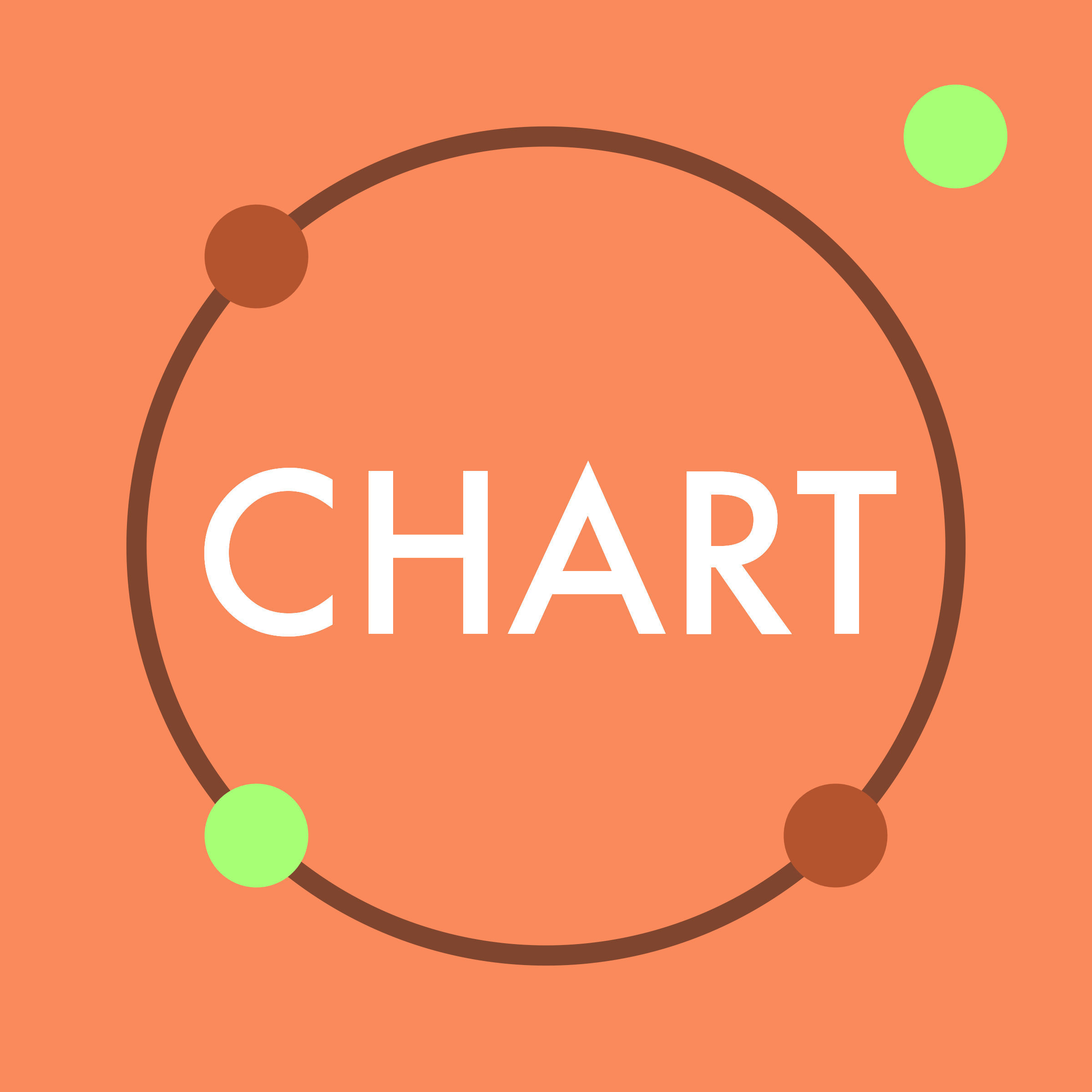
#FA8A5B Chart
- Basket ball orange colour
- Represents different topics
#EB526F Story
- Pinkish red colour
- Represents negative sentiments
#D8F794 Other
- Light khaki colour
- Represents different topics
In addition to our ident colours our palette contains many other colours:
Neutral
#F9F7F2
Grey light
#DCDCDE
Grey mid
#BBBBBD
Grey dark
#656370
Black mid
#4F4F4F
Black dark
#3B3B3B
Brand blue
#3172AD
Black light
#6B8EF3
Black mid
#4464AD
Black light
#2A3E6E
RAG green
#06402BE
RAG red
#B33134
Accessible colour combinations
We have designed our colours so that the tertiary lighter colour from the first four categories combined with the neutral colour passes WCAG AA requirements for both large and huge text, requiring a contrast ratio of at least 3:1.
3.6:1
#F9F7F2 on #1E8F91
3.2:1
#F9F7F2 on #A18826
3.6:1
#F9F7F2 on #C06845
5.6:1
#F9F7F2 on #AA3D4F
Where dark text colour is preferred, we can use the primary colour from the first four categories with the black colour for large text.
5.8:1
#3B3B3B on #1E8F91
6.2:1
#3B3B3B on #A18826
4.7:1
#3B3B3B on #C06845
3.2:1
#3B3B3B on #AA3D4F
Fonts
For headings we use Futura.
For body text we use Figtree.
GPCDS Idents
Visible Data is a trading name of GPCDS Labs. GPCDS is the name of our proprietary data visualisation framework and stands for:
Graph: graphical representations of data containing relationships (connections) between elements, for instance networks.
Plot: graphical representations of data where only data is plotted and all communication channels can be read quantitatively, for instance a scatter plot.
Chart: graphical representations of data including redundant information and/or communications channels requiring inference, for instance a line chart.
Data Story: graphical representations of data that move beyond charting data.
We designed these idents to represent the four families of visualisation which also inspired our brand colours.

Design choices
There are both major and minor idents for each family of visualisation that share these design properties:
| Design Element | Major Ident | Minor Ident |
|---|---|---|
| Filled square | Each ident is a 1:1 rectangle filled in the primary colour for the category. | |
| Disks | Each ident contains four disks, two in the secondary colour and the other two in the tertiary colour from the category | Each ident contains two disks, using the secondary and tertiary colour from the category |
| Lines | Each ident contains one or more lines using the tertiary darker colour from the category | Each ident may contain a line using the teriary darker colour from the category |
| Text | Each ident contains the number of the category using the Futura font | Minor idents don’t contain text |
The graph idents are simple graphs. In the major graph the edges are either at 180 or 60 degrees to one another, and the closed triad is placed to draw the reader to the cente of the four-wise arrangement.

The plot idents are inspired by scatter plots. In the major ident the disks are placed on the line y = -x to enclose the idents in the four-wise arrangement. The word “plot” is displayed in the top-right corner as that’s the placement of the ident in the four-wise arrangement.

The chart idents are inspired by bubble charts, but could also be interpeted as something more complex. In the major ident all four of the smaller disks are placed on the lines y = ± x with the top-right disk placed off the “bubble” to bring the viewer’s gaze to the centre of the four-wise arrangement.

The data story idents are designed to imply movement and include arrows which are not found in any other ident. In the major ident the arrows point to the centre of the ident itself instead of a position within the four-wise arrangement - to indicate that the story sometimes need to be centered over design.

Note that the logomarks were built with an R script.