Visible Data
We transform the way you communicate data through dataviz for all points with humans at the heart.

Data and text mix like oil and water.
Humans process visual data 60,000 times faster than text.
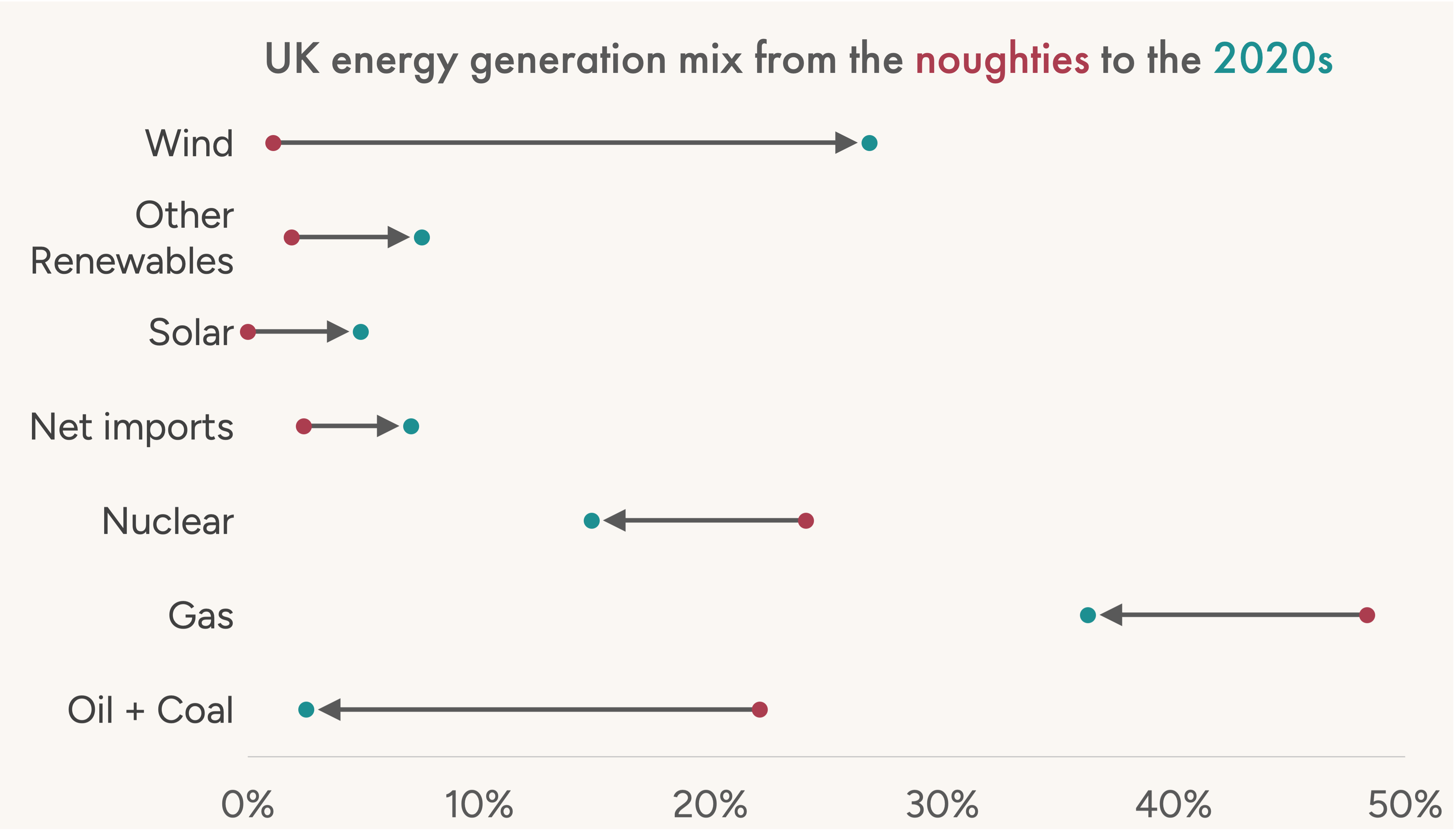
Here is a brief summary of how the UK power grid transformed between the 2000s and 2020s:
- Coal Collapsed: Dropped massively from nearly a third of all power (32.5%) to just 1.3%.
- Wind Surged: Exploded from under 1% to 24.4%, replacing coal as the second-largest energy source.
- Other Renewables Jumped: Solar and biomass saw major gains, growing from a combined 2% to over 16%.
- Gas Remained #1: Natural gas is still the primary power source, but its share dipped from 39% to 33%.
- Nuclear Declined: Dropped from 19.4% to 13.5%.
In short: The UK went from a heavily fossil-fuel-reliant grid (over 70% coal and gas) to a much greener, diverse system powered largely by gas, wind, and nuclear.
Accessibility is no longer a design suggestion. It is a compliance mandate.
There is real, active legislation in both the EU and US. Superficial automated fixes don't work — and over 1 billion users with disabilities are paying attention.
The Deadlines are Here
The European Accessibility Act (EAA) passed in 2025 — new services must comply immediately, existing ones by 2030. The DOJ has ruled US state and federal digital operations are legally bound to the same strict standards.
The Cost of Inaction
Currently, 95% of websites fail basic accessibility requirements and data visualisations have even stricter needs. EAA penalties can reach 5% of turnover, leaving an estimated €107+ billion in total market value completely exposed to legal risk.
The Automation Trap
Accessibility overlays don't work — users block them and regulators are actively penalising deceptive automated compliance platforms. Real inclusion means shifting left: embedding accessibility from the design stage, not bolting it on.
Meet Pier: Your human-first data communication workspace
Data-driven products and services rely on accessible, understandable data communication. That's hard. Pier sits directly in your existing workflows as a powerful workspace to move from raw messy data to impactful, compliant and beautifully tailored data visualisations.
Choose Your Medium & Tool
Stop dashboard hell before it starts.
Select the exact medium your stakeholders need—whether it's an interactive dashboard, a formal report, an executive deck, or short-form video. Pier dynamically filters constraints based on your specific medium and enterprise software permissions, eliminating tool sprawl from minute one.
Profile Your Data Safely
Automated data quantification without the security risks.
Provide your data via secure file upload, native connectors, or programmatic API. Pier's built-in Data Quantifier securely parses and classifies your data types, variable domains, and measurement units locally, prepping your data structure without exposing sensitive inputs to external networks.
Algorithmic Recommendation
The perfect chart type, guaranteed.
Skip chart paralysis. Pier applies our proprietary grammar-of-graphics heuristics engine to cross-reference your specific data structure against your enterprise configuration, instantly recommending the most effective, accessible, and compliant visualization type for your audience.
Human-First Storytelling Coaching
Move past generic checkbox compliance.
Pier coaches you through the design process in real time. Powered by our internal Foundry and Compass modules, the software actively enforces strict branding guidelines, accessible color palette constraints, typography scales, and keyboard-navigable layout requirements before you build.
Embed Directly into Your Pipelines
Production-ready outputs in a single click.
Once approved, Pier generates the precise instructions, code scripts, spreadsheet workbook generators, or direct programmatic API bindings required to render the final chart natively inside your tool of choice.